


Top tips for making your website more user-friendly
Janneke Oxley • 14 February 2018
Does YOUR website give the right impression? Grab a coffee and read our 5-minute article on what to do to make the best of your website, regardless of what you do or sell!

A website is like a peep through your living room window. It tells people a lot about what you – and your company – are like. Of course, you wouldn’t invite people over to your house and welcome them into an untidy room full of clutter, not give them a welcome drink and feed them out-of-date food before sending them home. Make sure your website doesn’t do that either!
- Get to the point. According to Nielsen Norman Group (a bunch of clever people who spend their lives trying to work out exactly what it is we do online and how we could do it better), users may only read 20% of the words on your page. That means that if your website is cluttered, out of date or does not provide the information they are looking for, they are not likely to be there for long.
- Include a mission statement. No, not some creative out-of-the box story about why you are saving the world, but a clear statement that tells people:
- Who/where you are
- Who your audience is
- What they will get
- What benefit that will give them
Here at Island Buro, our mission statement reads like this:
“Island Web Design [our company] is where small and medium sized businesses on the
Isle of Wight [our audience] can find expert, practical advice and support on web
design, content and print services [what they can get from us]. Our goal is to help
you get more customers and better financial returns, while allowing you to get on
with what you’re good at - the running of your business [what benefit].”
- Who/where you are
- Say what you mean. Too many people fall into the trap of using jargon, abbreviations or internal lingo. Always make sure that your website can be read by someone who has only a limited grasp of your industry. Don’t try to be clever, but empathise with your visitors and use words they would use. If you promise to get back to people the same day after an enquiry, don’t tell them it will be by EOBD (End of the Business Day) but say 5pm. Just because you know CMS is a Content Management System, people who want to have a new website made don’t necessarily know that.
- Include a Team Page. People want to know about the person behind the product, and want to know, like and trust you before they buy from you. Include some photos of people working behind the scenes, plus a short two-line bio on each of your main employees. If someone in your company is particularly involved with or good at a certain aspect of the business, mention things like: “for spares, contact Graham – he knows exactly what we carry in stock at all times” or – not sure how much fabric you will need? Call and speak to Sophie, she has been here a long time and knows all about our fabric range”.
- Be mobile friendly. That is not optional. Not anymore. It may at one time have been a nice thing to do, but since Google updated their mobile search rankings algorithm, mobile-friendly web pages will now rank higher in mobile search results than non-mobile-friendly pages, and more and more people are searching for your company on their phone or tablet. And let’s be honest, you have been there, on websites that come up with print too small to read, photos that take too long to load, and information that has nothing to do with what you are looking for. Did you hang around? Didn’t think so. So, make sure that you have a mobile-friendly site that people can navigate around easily and make sure they have a good experience. That way they are much more likely to come back and buy from you.
More articles
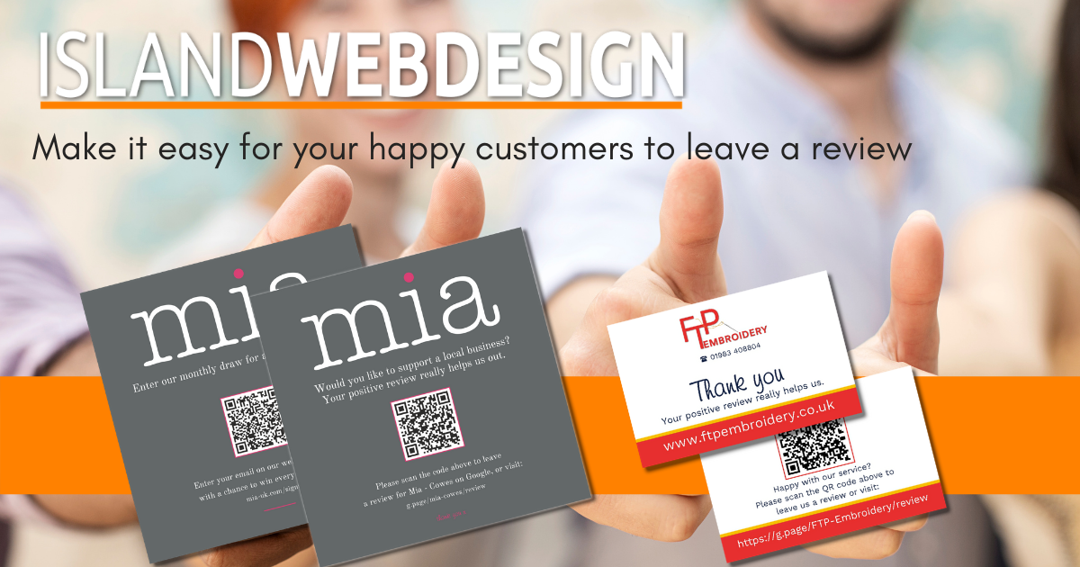
Give your Google Business profile some love and learn how to request positive reviews from happy customers. Reviews are good for ranking and even better for customer attraction and conversion.
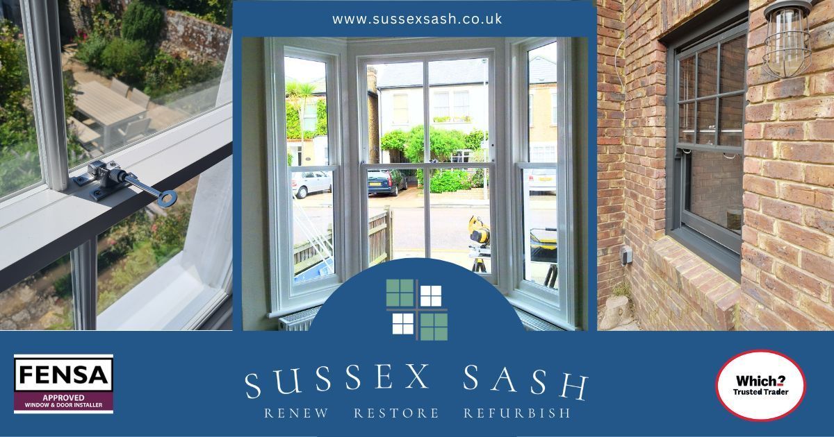
In the quiet corners of the Isle of Wight, where tradition meets craftsmanship, Sussex Sash stands as a beacon of expertise in the repair, refurbishment, and replacement of traditional joinery wooden sash windows.
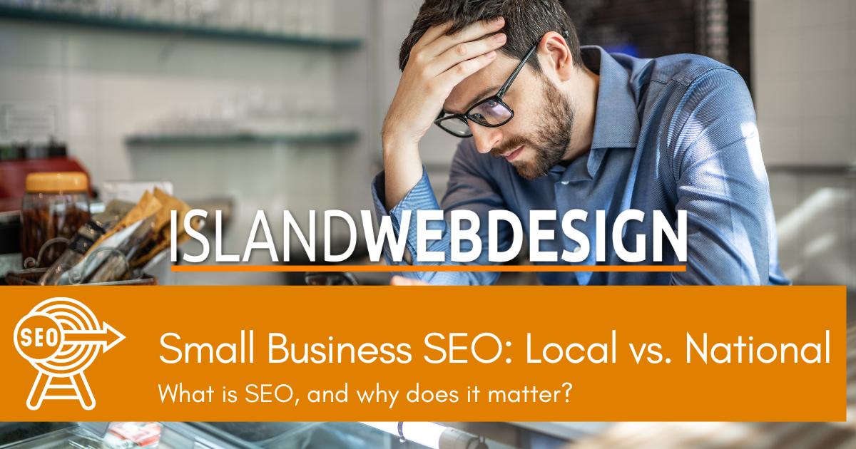
Understanding the differences between national SEO and local SEO allows businesses to tailor their strategies to their target audience effectively. By implementing the right SEO techniques, small businesses can level the playing field and thrive in the ever-evolving digital world.

Starting a new business can be exciting but also a bit scary. That is why we have a special discounted digital marketing & web design package for start-ups
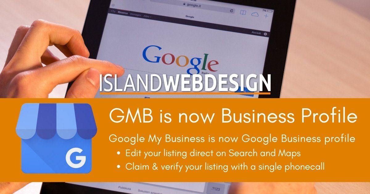
Google My Business has been rebranded and changes have been made to how you claim, verify and manage your business listing!
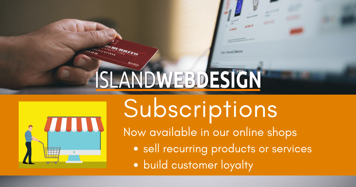
We have a new offering in our online shops that creates recurring revenue and increase customer loyalty: Subscriptions!
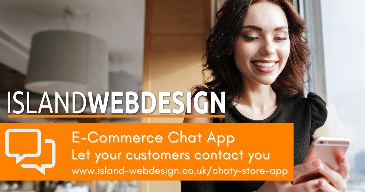
Chat with your e-commerce customers using their favourite channels. Proven to increase sales and build customer trust
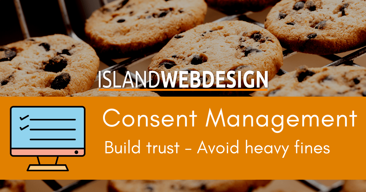
Build trust with your site visitors - Make transparency and consent a pillar of the relationship with your customer.
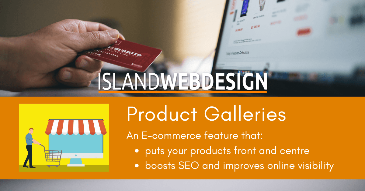
Showcase your products in our exciting Product Galleries and also filter the products by status and category.